In the tutorial, we will discuss how to use charts, graphs, fill slides, and thermometers in LabVIEW. First, we will cover the introduction and uses of graphs and charts, and then we will focus on the example of the conversion of temperature from the Fahrenheit scale to the Celsius scale. We will do this using the conversion formula we have been studying since elementary school. The example program is explained point by point, and the reference figures are added wherever required. At the end of the tutorial, we have provided an exercise that you are supposed to do on your own, and by the next tutorial, we will assume that you have already completed that example correctly. We are not going to explain the concepts regarding that exercise.
Introduction to Charts and Graphs in LabVIEW
Someone said, “A picture is worth a thousand words”. What about graphs and charts? Graphs and charts have always been helpful in data analysis to see the variation of data with time. One can easily see the variation of data with time or any other independent variable when it is stored in the form of graphs or charts. There are various types of graphs and charts. Reading information about the number of particular things in a category can also be done using charts or graphs without going back to the data table (which is quite a hideous task to perform). A graph can also be defined as a pictorial representation of data. The basic purpose of this tutorial is to familiarize the reader with the concepts of drawing graphs and charts in LabView programming.
In the previous tutorials, we learned about the introduction of LabView and how to write a simple LabVIEW basic program to do string and numerical operations. In this tutorial, we will use the built-in graph and chart functionality blocks to plot various data points and plot graphs.

LabVIEW Program Including Graphs and Charts
- Create a new Blank VI as explained in the first tutorial and save it for future use, as we have done in previous tutorials, or press <Ctrl+S>.
- After saving, come to the plotting part. Let’s begin with the introduction of simple functionality blocks.
- In the example below, we are going to look at how charts and graphs work in LabView. Then, we are going to design a simple LabView program that will convert temperature from Fahrenheit to Celsius scale; at the end of the conversion, the VI will display the temperature variations on charts (colored scales).
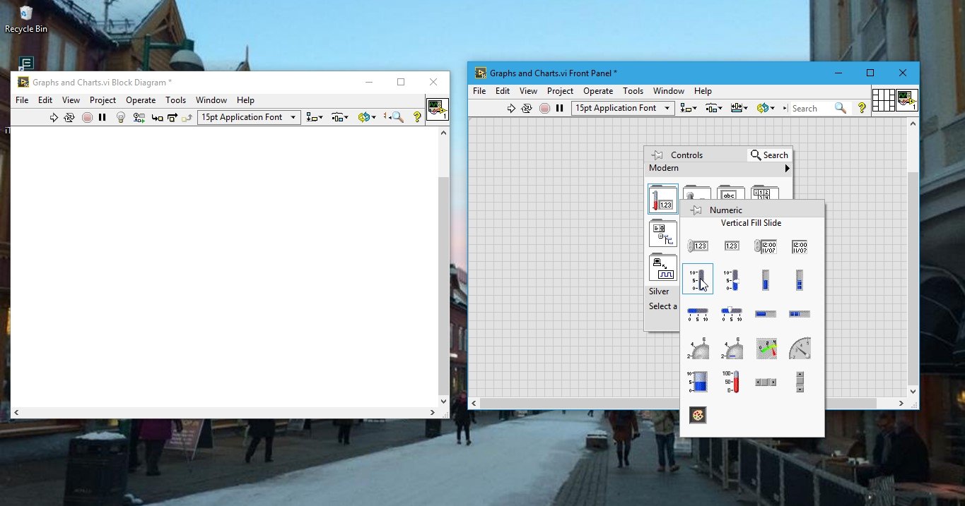
Vertical Fill Slide Placement
Right-click on the Front Panel, and from the Control Palette, select Numeric and then select Vertical Slide Bar. Name every block properly; this block will provide the temperature in Fahrenheit, which we will convert to Celsius.
Using the formula for the conversion of temperature from one scale into another as given in the equation below:
Tc = 5/9(Tf – 32)
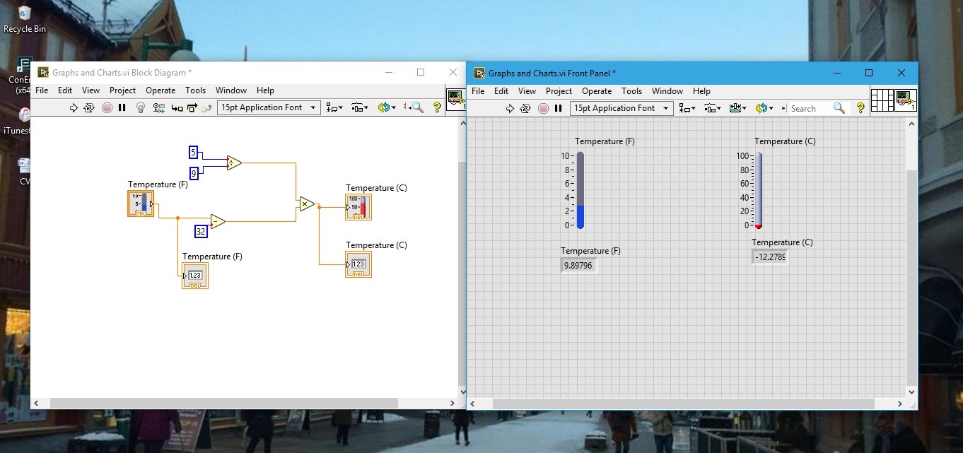
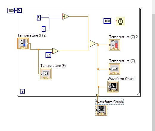
To fulfill the conditions in the above equation, we need the division, subtraction, and multiplication blocks. Connect the output of the Temperature slider to the upper input of the subtraction block, which is available in the Function Palette in the Numeric section, and at the other side of the subtraction block, connect a numeric constant and set its value to 32.
This task is accomplished in order to cover the portion of the equation defined above. From the same section, select the division block, and at the upper end of it, connect a numeric constant of value 5, whereas at the lower input, connect a numeric constant of value 9.
Now, place a multiplier block from the same section. At the input of this block, connect the output from the subtraction block and the division block we have just installed. The resulting block diagram will look like the one shown in the figure below.

Thermometer Placement
The output of the multiply block will give the temperature value in Celsius. Now, right-click on the Front Panel, and from the Control Palette, select Numeric, and then select Thermometer, as shown in the figure below.

Fahrenheit to Celsius Scale Conversion Block Diagram
Connect the associated block of this thermometer with the output of the multiply block and name all the blocks properly. The resulting block diagram is shown in the figure below.

Also attach a numeric indicator at the temperature in both scales, i.e., at the input temperature and at the temperature block after conversion, using the knowledge from the previous tutorials.
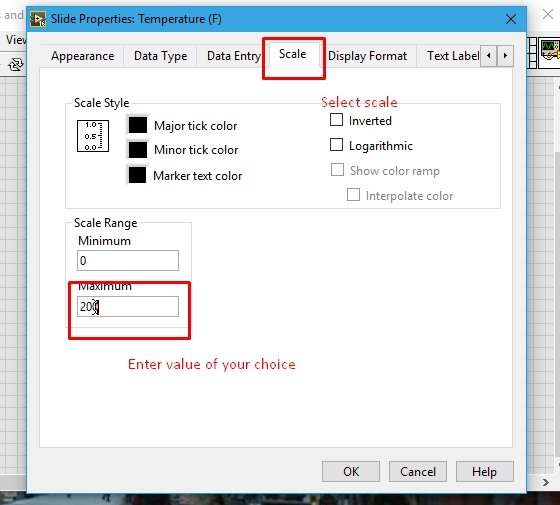
You can see that the scale of the vertical slide fill is just from 0 to 10. If we want to change the scale of the fill, right-click on the vertical slide fill and select properties. From the properties block, select scale and set its maximum value to the desired value of your choice. Refer to the figure below.
Now run the program by clicking the run button or pressing <Ctrl+R>. If you want to change the value of the slide fill during runtime, simply press the run continuously button on the block diagram (next to the run button).

Waveform Charts in LabVIEW
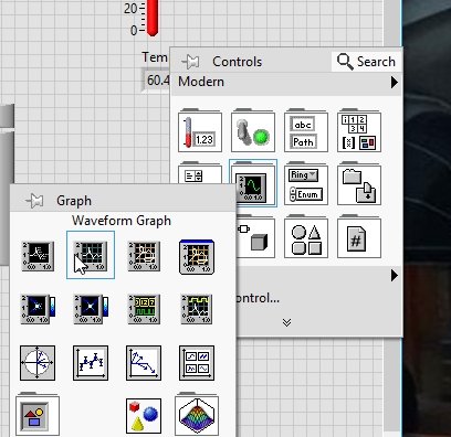
This was just the bar graphs; now we will look at the charts and graphs portion. From the Control Palette, select Graph, and then select Waveform Chart.
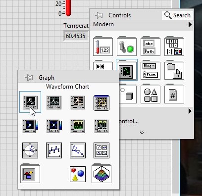
Connect the Waveform Chart block in the block diagram window with the output of the multiply block. Now run the VI continuously and change the value of the input temperature (F) from the slide fill. You will see the variation of the data in the chart when you vary the temperature. See the figure below.

Graphs in LabVIEW
Now, let’s come to the graph portion. In order to see a graph of data, we need to have a data set of any type over some period of time. For that purpose, we will use a “for” loop. Set its number of iterations to a desired value, place a wait block inside the loop, and place all of these blocks present on the Block Diagram window inside the loop. From the output of the multiply block, connect a wire to the edge of the “for” loop; this will allow us to connect a block outside the loop. From the control palette, select Graph, and then select Waveform Graph, as shown below.
Connect the Waveform Graph block to the edge of the loop, as shown in the figure below.
Run the program and change the temperature continuously using the slide fill. We will see the variation of temperature on the chart, but nothing will be displayed on the graphs. As soon as we stop the program or the number of iterations is complete, all the data for the variations we have performed will be displayed on the graph. See the figure below.
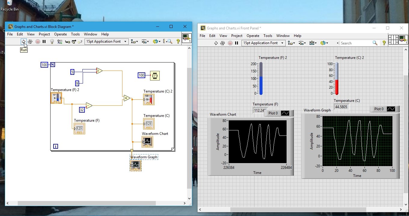
From the above example, we can conclude that the waveform charts in LabView give us point-to-point information about the data with respect to time, whereas the graphs give us information about the data’s variation over a defined period of time.
Exercise:
- Do the above example, and try to convert temperature from Celsius to Fahrenheit scale.
We haven’t provided any hints or concepts to complete this example. Still, if you are unable to solve this on your own. Let us know we will add hints.
Conclusion
To conclude, this tutorial provided a comprehensive introduction to charts and graphs in LabVIEW. It walked through the process of creating a LabVIEW program that incorporates graphs and charts to visualize data points and plot temperature variations. The tutorial covered the placement of vertical fill slides, the conversion of temperature from Fahrenheit to Celsius scale, the usage of thermometers, and the implementation of waveform charts and graphs. By following the step-by-step instructions and examples, readers were able to gain a solid understanding of how to utilize charts and graphs in LabVIEW programming. With this knowledge, readers can now apply these concepts to their own projects and effectively analyze and present data using visual representations in LabVIEW.
Related Articles:
You may also like to read:
- Plot Sensor Readings in Real Time Charts with ESP32 and ESP8266 Web Server
- OLED Interfacing with TM4C123G – Display Texts and Graphics
- ESP32/ESP8266 Thermostat Web Server – Control Output Based on Temperature Threshold
- Raspberry Pi Pico W Publish Sensor Readings to Node-Red Dashboard through MQTT
- Calculate Factorial of a number in LabView : tutorial 35
- read and write data to excel files in labview : tutorial 22
This marks the end of today’s article. If you still have any questions or issues, let us know in the comment section below.