In this tutorial, we will learn about property nodes in LabVIEW. These are used to change the visual properties of a control or an indicator using another control or indicator, as we will see in detail in this tutorial. At the start, we provided a brief introduction, and after that, an explanation using a VI is provided, which helps us understand property nodes in detail. At the end of the tutorial, we have provided an exercise to do by yourself, and in the next tutorials, we will assume that you have done these exercises, and we will not explain the concept regarding them.
Introduction to Property Nodes in LabVIEW
In LabVIEW, property nodes are used to make our program powerful and fun to work with. We can change or control the properties of front-panel objects programmatically by using property nodes. With the help of property nodes, we are allowed to programmatically change the color, position, visibility, and display of almost all the controls and indicators on the front panel during runtime.
What does the word programmatically mean here? This means changing the properties of the objects present on the front panel using the objects already present on the front panel, as we will see in detail in the example provided in the explanation section. One can change the color of a slide bar depending on its present value using property nodes. We can also change the visibility of a control or an indicator depending on another button or knob. We can also use a custom control to animate our front panel’s screen or to symbolize some physical process. These kinds of properties of the front panel make the user’s experience even better.
Example of Property Nodes in LabVIEW
Create a VI as we have explained in Tutorial 1 and save it for future use by pressing <Ctrl+S>. If we want to create a property node, we must first place a control on the indicator whose property node we want to create. From the control palette on the front panel, select Boolean, and then select Push Button. Place the button on the front panel as shown in the figure below,

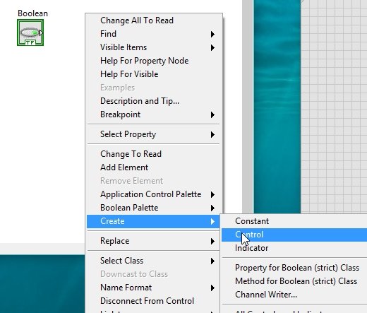
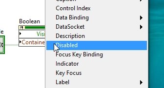
On the corresponding block of the push button on the block diagram window, press right-click, and a dropdown will appear. Select Create from the dropdown, then select Property Node, and a list of property nodes will appear as shown in the figure below.

Visibility Node Block
We will first use the visibility node from this list. The block of a visibility property node is shown in the figure below.

This block will allow us to change the visibility options of the block from which it is created. All the property nodes are set to read mode by default. If we want these nodes to control other blocks on the front panel, we must change their mode to write. Right-click on the visibility block, and from the menu select Change to Write, as shown in the figure below.

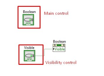
This will create a pin on the input side of the visibility node. Right-click on that pin and create a control, as we have done in previous tutorials. Referring to the figure below.
Control Types
We can see that the control for which we created a property node was a Boolean; therefore, this Boolean will help us control the visibility of the main control, as shown in the figure below.
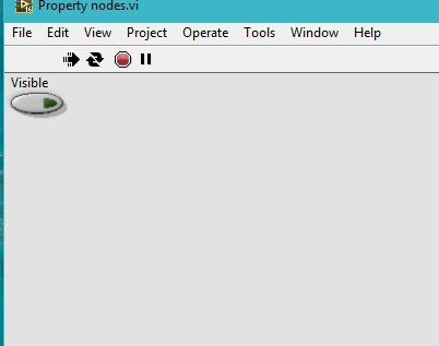
Run the VI continuously by using the run continuously button. We can see that when the visible button on the front panel is turned off. The main Boolean button will not be visible on the front panel, as shown in the figure below.
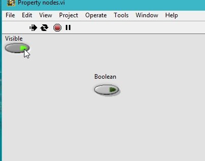
Now during the runtime, if we press the visibility button and turn it on, the main Boolean button will also appear on the front panel, as shown in the figure below.
This is one property of a complete list that we can change programmatically. It is impossible to discuss all of the property nodes in one tutorial; we will, therefore, discuss a few of them and leave the rest for the reader as an exercise.
Size Expansion
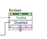
Now, expand the size of the property node we just created by using the size tool automatically generated from the tools palette, as shown in the figure below.

Place the cursor on the second block; using the finger tool, click on the block and the property node list will appear again, as shown in the figure below.
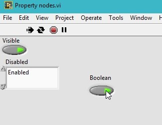
For example, if we have chosen the disabled property node, the block will already be set to write; if it is not, then change it to write as we have done before. Create a control at the input side of the disabled block and arrange the blocks as shown in the figure.

Run the program continuously using the run continuous button. When the block of the disabled control on the front panel is set to enable, we can turn on and off the main Boolean block, as shown in the figure below,
Now, from the selector of the disabled control, change the enable to disable as shown in the figure below, and try to push the Boolean button this time. The VI will not allow us to push the button as the property node has already disabled it.

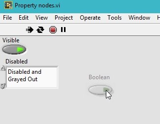
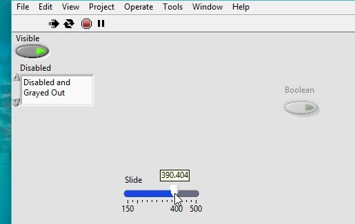
There is a third option in the disabled property node, which is disabled and grayed out. Change the selector option of the disabled block to disabled and grayed out; now the main Boolean push button will be gray in vision and also disabled, as shown in the figure below.
We can still change the visibility option from the visibility button no matter how many additional property buttons are installed, as shown in the figure below.

Size Extension
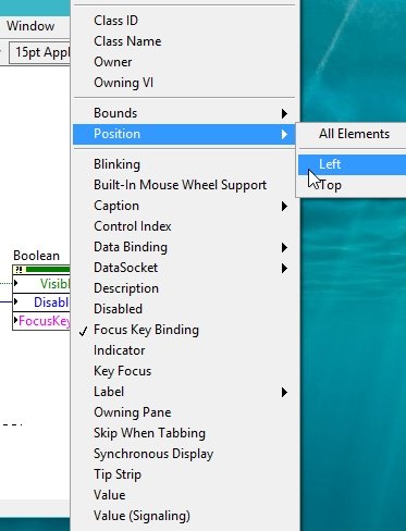
The third property node I am going to discuss here is position control. Let’s change the position of the Boolean push button with the help of a pointer slide. On the property node, again extend the size of the node to one more block, as shown in the figure below.
Change the property of the third block again by using the finger tool and selecting position, and from the submenu, select left as shown in the figure below.
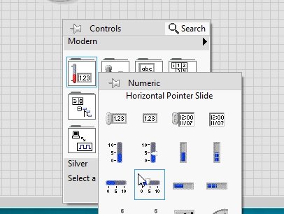
Now on the front panel, from the Control Palette, select Numeric, and then select Horizontal Pointer Slide, as shown in the figure below.
Now, change the upper and lower limits of the pointer slide according to the current position of the main Boolean block, as shown in the figure below.

Block Diagram
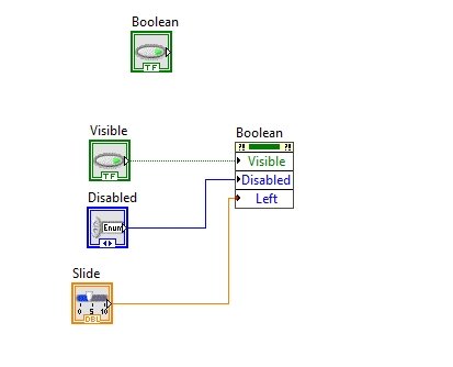
Connect the corresponding block of the slider on the block diagram window to the input side of the position property node, and the resulting block diagram is shown in the figure below.
Now, run the program continuously using the run continuously button and change the position of the pointer slide; this will also change the position of the main Boolean block. See the figure below.
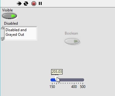
Varying the position of the pointer slide will vary the position of the main Boolean block correspondingly, as shown in the figure below.
Exercise
- Explore the remaining properties of property nodes that you can change programmatically.
Conclusion
In conclusion, property nodes in LabVIEW provide an efficient and powerful way to programmatically control and modify the properties of controls and indicators on the front panel. By utilizing property nodes, developers can dynamically change the color, position, visibility, and display of these elements during runtime, enhancing the user experience and making programs more interactive. This tutorial has provided a comprehensive overview of property nodes, along with practical examples and exercises for readers to explore and further expand their knowledge. With the ability to customize VI properties using property nodes, developers can create more dynamic and engaging applications in LabVIEW.
You may also like to read:
- STM32 I2C Communication Guide – HAL Code Examples Slave & Master – DMA Interrupt
- DAC STM32F4 Discovery Board – Generate Waveforms with Digital to Analog Converter
- Buck Converter Proteus Simulation
- FreeRTOS Event Groups – Tasks Synchronization Example with Arduino
- Ethernet based Home Automation using Arduino – IOT
This concludes our tutorial. If you face any issues or difficulties, let us know in the comment section below.